We recently made a few more updates to our kitchen. It's had a maja transformation - and we couldn't be happier with how it's improved.
But first, lets revisit the kitchen as we inherited it from the previous homeowners (minus the wicker furniture designed for very small people who don't actually want to be comfortable).
To the Italian words and star mural in cranberry and gold metallic paint....sorry I'm not sorry to see you go.
BEFORE:
**you can read more about our kitchen transformation here**
The change with the most impact, of course, came from the paint. Painting the cabinetry white immediately updated the room and I love the contrast with the gray walls.
Pendant lights replaced the track lighting over the island and new hardware graces the drawers and cabinet doors.
However, we longed for an updated backsplash sans painted tiles and a more cohesive countertop.
So, out with the old backsplash and countertops....
And in with the new.
It's like a breath of fresh air!
We are absolutely in love with the decisions we made....and seeing as how we spend most of our time in this very room, we are tickled with the improvements.
Don't get me wrong, this was an expensive update, but we planned and saved for the reno, and it had been on our to-do list since moving into our house about 18 months ago.
We chose the always-chic white subway tile as our new backsplash, and had under cabinet lights from Lowe's installed.
We chose a white granite with very little movement...just subtle specks of gray, cream, white and black.
I.love.it.
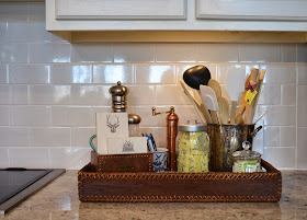
Our mini-reno inspired me to clean clean clean. I cleaned out the pots and pans, utensils, and our spices; organized the tupper-ware, edited what's on the counter, and put everything in it's rightful place.
A little Spring cleaning you might say.
I'm trying to decide which chairs I'd like to use around the new/old kitchen table. I bought it from one of my favorite dealers at Scott's....it's old and rough and has a story, which I love.
The proportion of it suits this room much better, I wanted something with a bit of patina.
Not only do we cook our meals here and eat at the breakfast table, we spend time hanging out on the little sofa.
Henry plays here every morning while we have our coffee and get breakfast made.
This space gets a lot of use.
I added the bottom painting to the wall vignette above the sofa and re-configured my plates....this is one of my favorite things to do!
Hope you enjoyed these fun updates to mi casa! I promise to keep sharing my client reveals next!


Gorgeous transformation! I just wrote about my favorite kitchen spaces and yours has got to be added to the bunch...
ReplyDeletexo Lily http://whilemyboyfriendsaway.blogspot.com/
The result looks great, Maggie. It’s brighter than before, and you definitely add a modern touch on it with the decorations and furniture. And I agree, the color white paint of the cabinets and the color grey painting of the wall complement well to each other. Two thumbs up!
ReplyDeleteArthur @ ContractorExpress.com
I agree with you. The renovation you did is quite uplifting! I think it helped that you painted your cabinets white, because they lit up the whole area. That way, the kitchen looked wider and spacious. Cheers!
ReplyDeleteLovella Cushman @ Perfection Plumbing
Wow, so many lovely changes. I like the new colours that you are using. They are really a good way to make your kitchen look more inviting. The way that you have positioned the pendant lights will give you optimal lighting and adds to the decor. The choice of seating is good as well. Those are a bit unusual and enticing.
ReplyDeleteHomer Collins @ Pinnacle Renovations
Nice post. I was checking constantly this blog and I am impressed! Extremely helpful information specially the last part I care for such info a lot. I was seeking this particular information for a very long time. Thank you and good luck. 3d innovations - renovation singapore
ReplyDeletei really like this article please keep it up. Painters in La Crosse WI
ReplyDeleteI think this is an informative post and it is very useful and knowledgeable. therefore, I would like to thank you for the efforts you have made in writing this article.
ReplyDeleteinterior design dubai
mep consultants in dubai