2.28.2014

My Kitchen Renovation


We recently made a few more updates to our kitchen. It's had a maja transformation - and we couldn't be happier with how it's improved. 

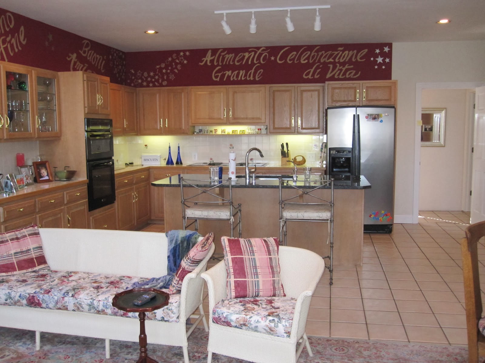
But first, lets revisit the kitchen as we inherited it from the previous homeowners (minus the wicker furniture designed for very small people who don't actually want to be comfortable). 

To the Italian words and star mural in cranberry and gold metallic paint....sorry I'm not sorry to see you go. 

BEFORE: 
**you can read more about our kitchen transformation here**


The change with the most impact, of course, came from the paint. Painting the cabinetry white immediately updated the room and I love the contrast with the gray walls. 
Pendant lights replaced the track lighting over the island and new hardware graces the drawers and cabinet doors. 
However, we longed for an updated backsplash sans painted tiles and a more cohesive countertop. 

So, out with the old backsplash and countertops....


And in with the new. 
It's like a breath of fresh air! 
We are absolutely in love with the decisions we made....and seeing as how we spend most of our time in this very room, we are tickled with the improvements. 


Don't get me wrong, this was an expensive update, but we planned and saved for the reno, and it had been on our to-do list since moving into our house about 18 months ago. 


We chose the always-chic white subway tile as our new backsplash, and had under cabinet lights from Lowe's installed. 


We chose a white granite with very little movement...just subtle specks of gray, cream, white and black. 

I.love.it.


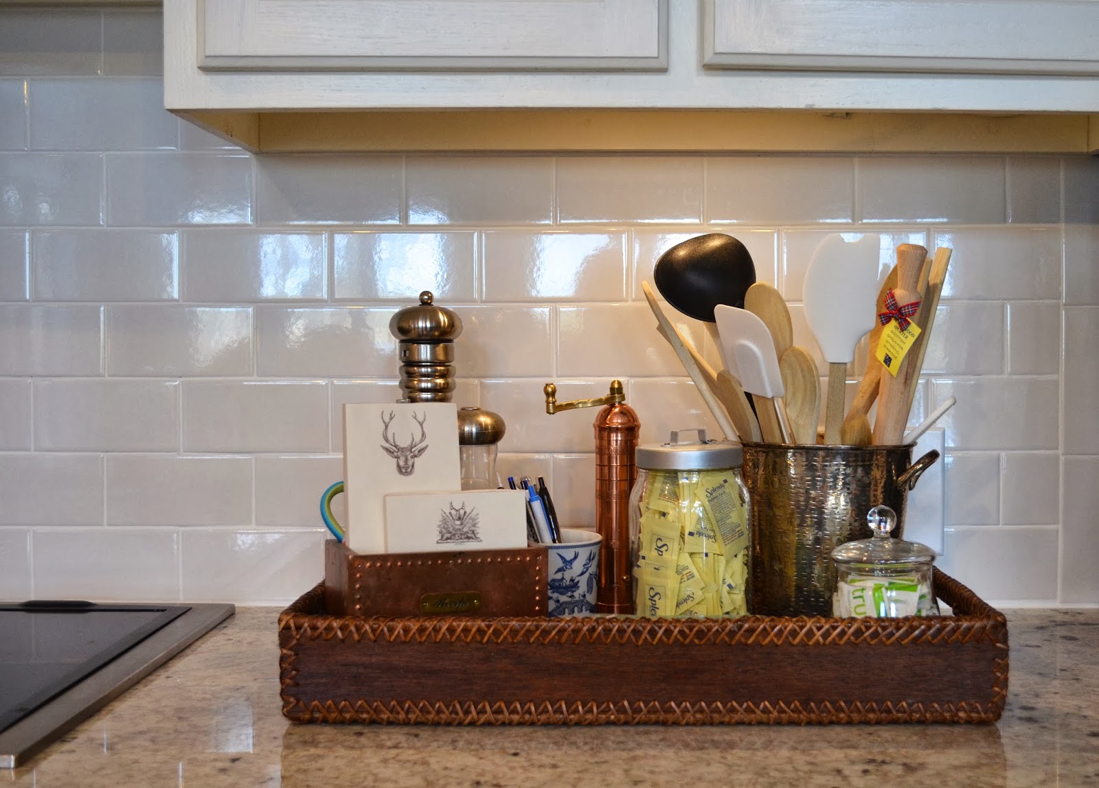
Our mini-reno inspired me to clean clean clean. I cleaned out the pots and pans, utensils, and our spices; organized the tupper-ware, edited what's on the counter, and put everything in it's rightful place. 
A little Spring cleaning you might say.


I'm trying to decide which chairs I'd like to use around the new/old kitchen table. I bought it from one of my favorite dealers at Scott's....it's old and rough and has a story, which I love.

The proportion of it suits this room much better, I wanted something with a bit of patina. 


Not only do we cook our meals here and eat at the breakfast table, we spend time hanging out on the little sofa. 
Henry plays here every morning while we have our coffee and get breakfast made. 
This space gets a lot of use.

I added the bottom painting to the wall vignette above the sofa and re-configured my plates....this is one of my favorite things to do! 


Hope you enjoyed these fun updates to mi casa! I promise to keep sharing my client reveals next! 

2.19.2014

Chinois Chic: A Baby Girl's Room

What do you do when a friend and client calls with a 3rd baby girl on the way?!?!
Squeal with excitement, of course! And get to plannin' the new nursery!

For this nursery, we wanted to do something that had quite a mix of things....a bit trad, a bit glam, a bit Chinois, with a touch of baby whimsy. It made it all the more fun that this room will double as a guest room. That happens when there's so many {sweet} little girls under foot!

I wanted to share the fun mood board for this space, and get you all excited to see the finished room soon! 
xoxo!


2.17.2014

Inspiration Avenue 2014: A Room Thomas Jefferson Would Approve!


A few weeks ago, I had the most fun day helping James Farmer install his space on Inspiration Avenue at the Cathedral Antiques Show
Just one day shy of the Snowpocalypse of 2014, we spent the bright, sun-shiney day hanging plates, pictures, and setting a beautiful table. 

Held at the Cathedral of St. Phillips on Peachtree in Atlanta, the week of the antique show is filled with two tours of homes, two parties, and new this year, the Inspiration Avenue.

James was chosen as a designer in this new concept, and I was happy to be a part! 
Along the first floor of the cathedral were large booths filled with antiques dealers - rugs, furniture, paintings, china, silver, and the like! 
Along the second floor, in the Sunday School classrooms, were the I.A. vignettes assigned to the designers. Each design team was to chose an historical figure on whom to base their room, or to be inspired by. It was a fun challenge and exciting opportunity! 
James, being uber-talented and great-at-everything, was drawn to Thomas Jefferson.... At the same time, I had been thinking this too! 
Our minds just think alike! ;)
So, TJ it was! 

After researching Mr. Jefferson, and planning our mood boards, we visited the space to decide just what we'd need. The Sunday School walls were purple. A nod to Radiant Orchid, perhaps?
However trendy, we didn't think Pantone's Color of the Year quite applied to TJ, and went with the tried-and-true Palladian Blue. 
Soft yet vibrant with just the right touch of green, it provided the prettiest backdrop for the collections James amassed for display.  

Here's our space before:


And here is how James felt Thomas Jefferson may have dined today...

Stay tuned to All Things Farmer for more info on all the pretties in this space!